Applied MathematicsStatistics |
How is statistical data presented? |
There are many ways to present statistical data, all of which involve graphical means to translate the results of statistical tests. A histogram is a graphical representation of a distribution function using rectangles. It is also most often constructed from a frequency table (see below). The widths of the rectangles usually indicate the intervals into which the range of observed values are divided; the heights of the rectangles indicate the number of observations that occur in each interval. The shapes of histograms vary depending on the chosen size of the intervals.
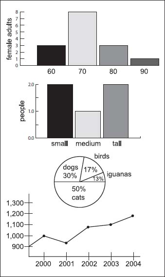
Here are four different types of charts used in statistics (from top to bottom): a histogram, a bar graph, a pie chart, and a line graph (statistics are not based on actual data here).
Bar graphs are similar to histograms, but with the columns separated by each other by small distances. They are commonly used for qualitative variables. A pie chart is another way to represent data graphically. In this case, it is a circle divided into segments, or “pie” wedges. Each segment represents not only a certain category, but its proportion to the total set of data. Another type of graph is the line graph, which is similar to those seen in geometry: a representation of the data from connected point to connected point. They are one of the most common graphs seen for simple statistical data collection.